


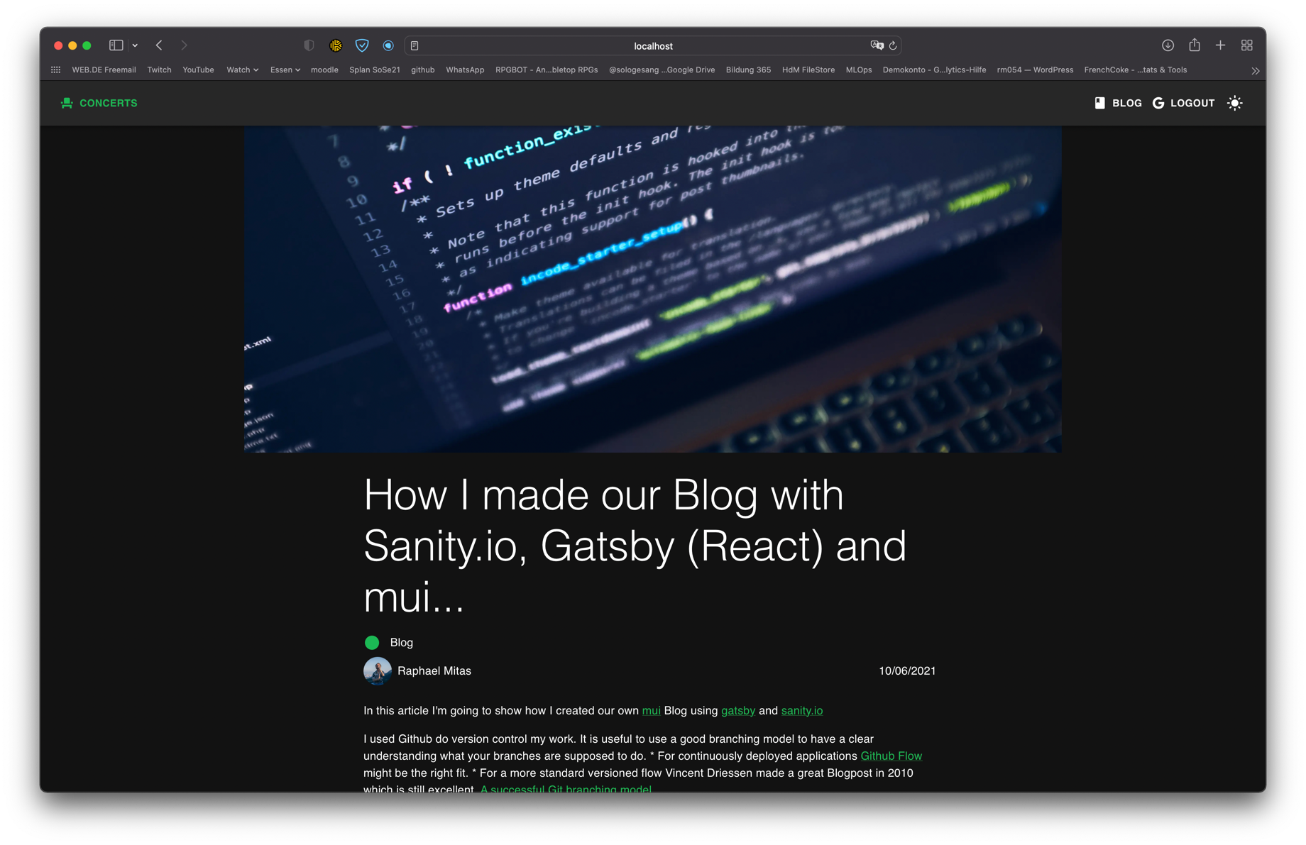
How I made our Blog with Sanity.io, Gatsby (React) and mui...
Blog
Raphael Mitas
10/05/2021
In this article I'm going to show how I created our own mui Blog using gatsby and sanity.io
I used Github do version control my work. It is useful to use a good branching model to have a clear understanding what your branches are supposed to do.
- For continuously deployed applications Github Flow might be the right fit.
- For a more standard versioned flow Vincent Driessen made a great Blogpost in 2010 which is still excellent. A successful Git branching model
Sanity.io has a great guide on how Build your first blog using React.
I adapted a few things to fit our needs...
Why Sanity, Gatsby and Material-ui?
Gatsby simplifies the development process by handling Routing, GraphQL queries and gracefully displaying images.
It also has build in features and plugins to tap into sanity.io, the highly customizable
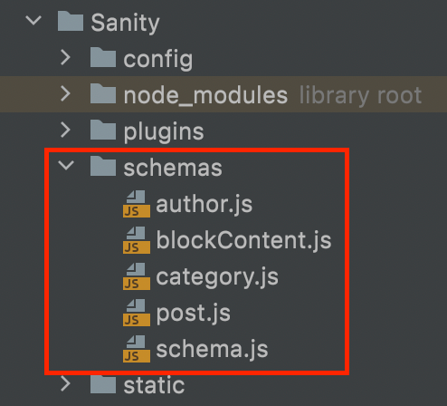
project structure
I set up the project structure as follows to create a monorepo on my Github
project folder
|-- src
    |-- Sanity
    |-- website
How I configured Sanity to fit our needs...
First I installed Sanity CLI globally. It makes sure you can use the command-line interface to set up your Sanity.io project.
npm i -g @sanity/cliNow we are going to activate Sanity for our project by using the following command.
Sanity init
You will have to answer a few questions.
If you haven't made a Sanity account and project you will have to create them on Sanity.io.
If you're struggeling a at this point of the installation refer to the Sanity.io guide
I linked earlier.
Note: the project structure I used earlier.
how to customize Sanity to your liking
For my Blog I wanted the Editors to be able to write their Blogposts with Markdown as well as pick a color for new categories. I added some plugins that help us achieve that.
Sanity Color Picker
https://www.sanity.io/plugins/sanity-plugin-color-picker
Sanity Markdown Plugin
https://www.sanity.io/plugins/sanity-plugin-markdown
Make sure you add them to your dependencies:
"dependencies": {
"sanity-plugin-color-picker": "^1.0.3",
"sanity-plugin-markdown": "^2.0.2"
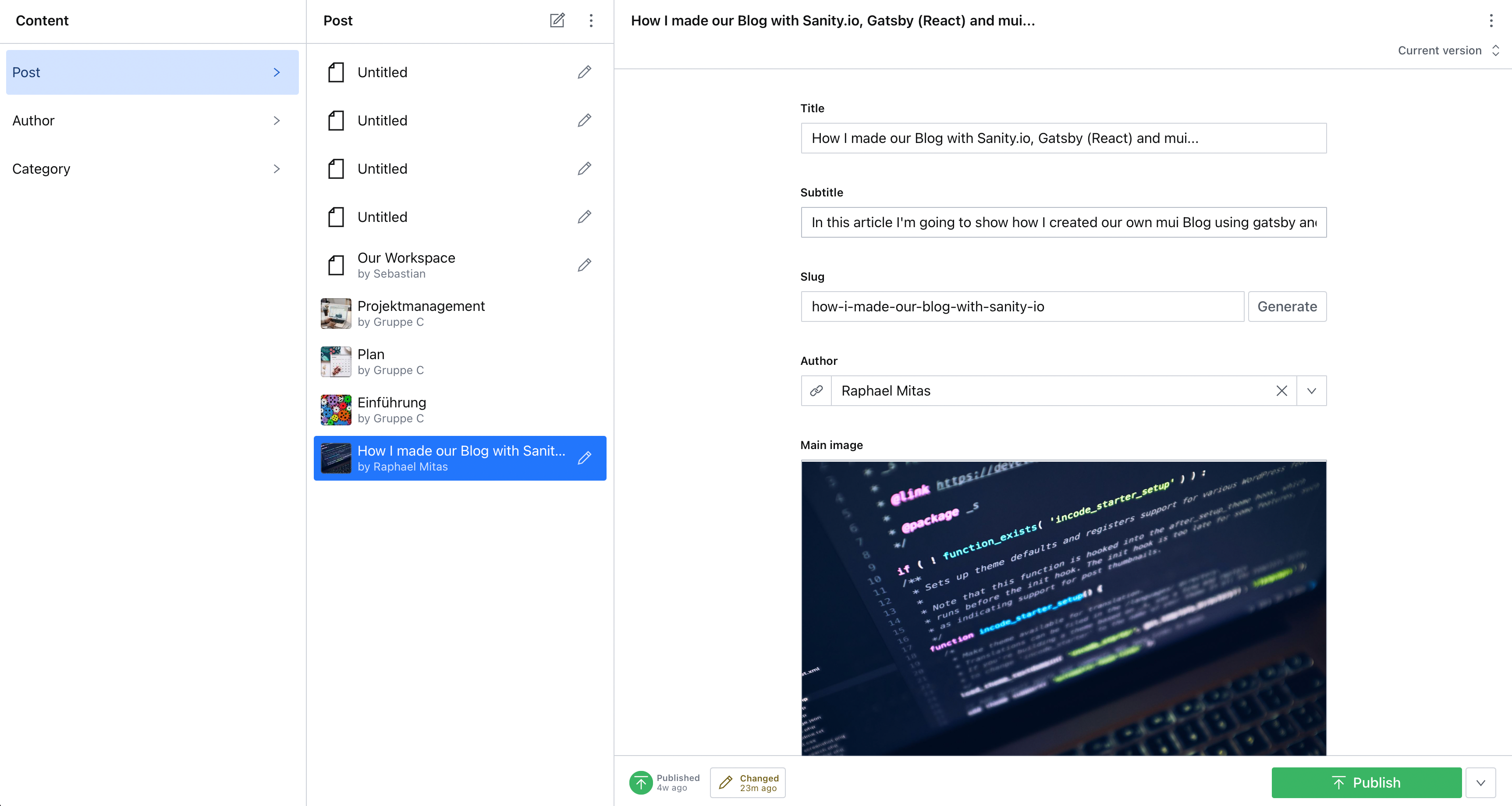
}For our Blog we only need an Author, Categories and posts.
You won't need blockContent if you want your editors to use Markdown


I won't go in-depth on what every single File does,
since they are self-explanatory.
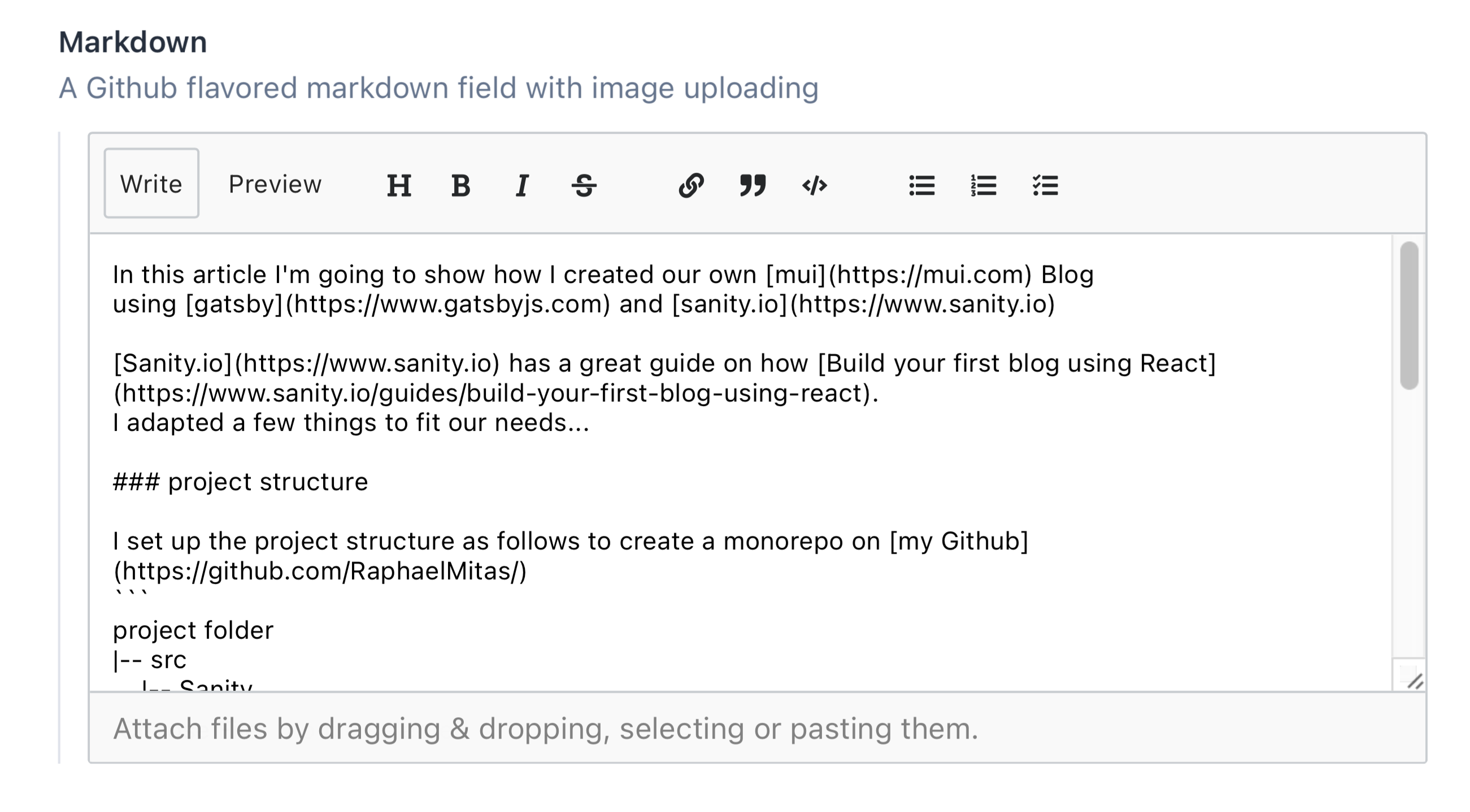
There is a simple schema they all follow. Here's an example of our new markdown plugin we used:
{
  title: "Markdown",
  description: "A Github flavored markdown field with image uploading",
  type: "markdown",
  name: "markdown",
}
The title defines what Title should be for our inputfield.
The description will be our subtitle.
The type defines which kind of feature is used here. In that case it's a Markdown input.
The name is how the field is defined. It basically an id.
This would look something like this:


Here is the code for all the files: skip to the final result
// schema.js

// First, we must import the schema creator
import createSchema from 'part:@sanity/base/schema-creator'

// Then import schema types from any plugins that might expose them
import schemaTypes from 'all:part:@sanity/base/schema-type'

// We import object and document schemas
import category from './category'
import post from './post'
import author from './author'

// Then we give our schema to the builder and provide the result to Sanity
export default createSchema({
  // We name our schema
  name: 'default',
  // Then proceed to concatenate our document type
  // to the ones provided by any plugins that are installed
  types: schemaTypes.concat([
    // The following are document types which will appear
    // in the studio.
    post,
    author,
    category,
  ]),
})
// author.js
export default {
name: 'author',
title: 'Author',
type: 'document',
fields: [
{
name: 'name',
title: 'Name',
type: 'string',
},
{
name: 'slug',
title: 'Slug',
type: 'slug',
options: {
source: 'name',
maxLength: 96,
},
},
{
name: 'image',
title: 'Image',
type: 'image',
options: {
hotspot: true,
},
},
{
name: 'bio',
title: 'Bio',
type: 'array',
of: [
{
title: 'Block',
type: 'block',
styles: [{title: 'Normal', value: 'normal'}],
lists: [],
},
],
},
],
preview: {
select: {
title: 'name',
media: 'image',
},
},
}// category.js
export default {
name: 'category',
title: 'Category',
type: 'document',
fields: [
{
name: 'title',
title: 'Title',
type: 'string',
},
{
name: 'description',
title: 'Description',
type: 'text',
},
{
name: 'color',
title: 'Color',
type: 'colorPicker'
}
],
}// post.js
export default {
name: 'post',
title: 'Post',
type: 'document',
fields: [
{
name: 'title',
title: 'Title',
type: 'string',
},
{
name: 'subtitle',
title: 'Subtitle',
type: 'string',
},
{
name: 'slug',
title: 'Slug',
type: 'slug',
options: {
source: 'title',
maxLength: 96,
},
},
{
name: 'author',
title: 'Author',
type: 'reference',
to: {type: 'author'},
},
{
name: 'mainImage',
title: 'Main image',
type: 'image',
options: {
hotspot: true,
},
},
{
name: 'categories',
title: 'Categories',
type: 'array',
of: [{type: 'reference', to: {type: 'category'}}],
},
{
name: 'publishedAt',
title: 'Published at',
type: 'datetime',
},
{
type: "markdown",
description: "A Github flavored markdown field with image uploading",
name: "markdown",
},
{
name: 'images',
title: 'Images',
type: 'array',
of: [{
name: 'image',
title: 'Image',
type: 'image',
options: {
hotspot: true,
},
}],
},
],
preview: {
select: {
title: 'title',
author: 'author.name',
media: 'mainImage',
},
prepare(selection) {
const {author} = selection
return Object.assign({}, selection, {
subtitle: author && `by ${author}`,
})
},
},
}The final result would look something like this:


How I made my Blog using Gatsby and React...
I'm not going to go too in-depth on how I actually coded the Website itself, since you might want it styled differently.
but here is the result...


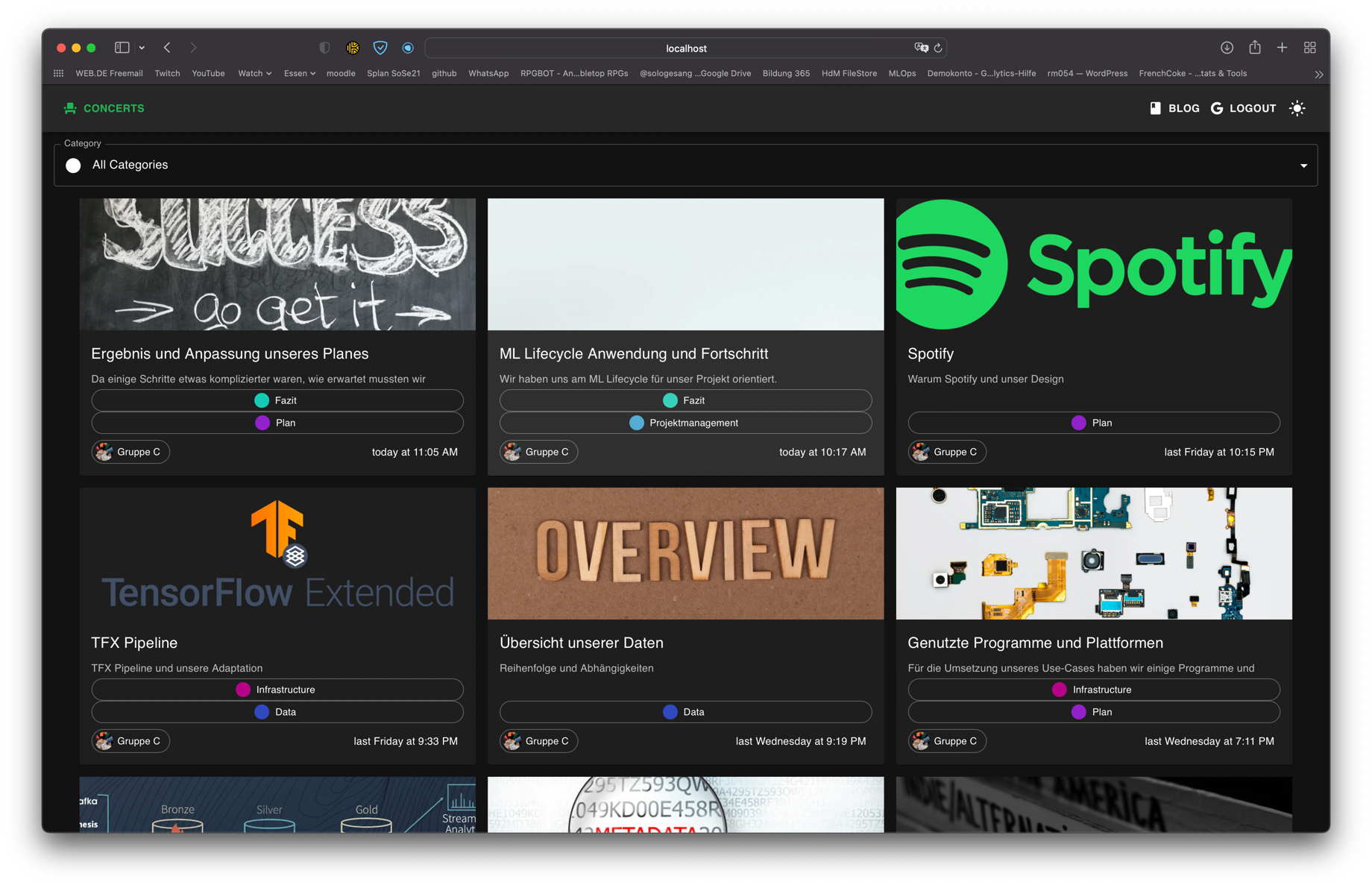

But I am going to talk about my overall strategy and layout.
My React Layout
|-- src
    |-- components (for components and private pages)
        |-- UI (for Theme, Layout and ThemeHandler - see Darkmode)
    |-- contexts
    |-- images (though most of the images we will be getting through Sanity)
    |-- pages (for public pages)
Create Pages automatically based on Sanity input
To create Pages automatically you need to use Graphql... here is how I did it...
If you want to skip to how I did the Darkmode go here
const path = require("path")

exports.onCreatePage = async ({ page, actions }) => {
  const { createPage } = actions

  // page.matchPath is a special key that's used for matching pages
  // only on the client.
  if (page.path.match(/^\/app/)) {
    page.matchPath = `/app/*`

    // Update the page.
    createPage(page)
  }
}

exports.createPages = async ({ graphql, actions }) => {
  const { createPage } = actions
  const queryResults = await graphql(`
    query AllSanityPost {
  allSanityPost {
    nodes {
      publishedAt
      title
      subtitle
      slug {
        current
      }
      author {
        name
        image {
          asset {
            gatsbyImageData(placeholder: BLURRED, aspectRatio: 1)
          }
        }
      }
      markdown
      mainImage {
        asset {
          gatsbyImageData(placeholder: BLURRED, aspectRatio: 2.5)
        }
      }
      categories {
        color
        title
      }
      images {
        asset {
          gatsbyImageData(placeholder: BLURRED)
          originalFilename
        }
      }
    }
  }
}
  `)

  const postTemplate = path.resolve(`src/components/BlogPost.js`)
  queryResults.data.allSanityPost.nodes.forEach(node => {
    createPage({
      path: `/blog/${node.slug.current}`,
      component: postTemplate,
      context: {
        // This time the entire product is passed down as context
        data: node,
      },
    })
  })
}
Darkmode
I used the great guide from Snappy Web Design to make my gatsby site work in dark and light mode...
for that I basically created 3 Files:
- Theme (there are 2 Themes in there... light and dark)
- ThemeHandler (this creates a Context that sets the state of the theme)
- Layout (this creates a Provider that swaps the theme based on the context and saves it in the browser cache)
Since we use gatsby we can't just wrap the DarkmodeState around our Pages themselves. Gatsby tries to optimise everything. In doing so it will make the Provider static so that the theme doesn't change as expected.
Luckily gatsby has also a solution for this:
gatsby-browser.jsgatsby-ssr.js
these Files allow us to customize all the Pages with our provider, like so...
export function wrapRootElement({ element, props }) {
  return <DarkModeState {...props}>
    {element}
  </DarkModeState>
}
Now you only need to wrap Layout around your pages and implement a button which toggles the darkmode based on the Context.
Theme.js
import { createTheme } from '@mui/material/styles';

const baseTheme = createTheme({
  typography: {
  }
})

const darkTheme = createTheme({
  ...baseTheme,
  palette: {
    mode: 'dark',
    primary: {
      main: '#1db954',
    },
    secondary: {
      main: '#1d82b9',
    },
  },
  props: {
    AppBar: {
      color: 'transparent',
    },
  },
})

const lightTheme = createTheme({
  ...baseTheme,
  palette: {
    type: "light",
    primary: {
      main: "#1db954"
    },
    secondary: {
      main: "#1d82b9"
    }
  }
})

export { darkTheme, lightTheme }
ThemeHandler.js
import React, { createContext, useReducer } from "react"
let SET_THEME;

export const darkModeContext = createContext()

export const darkModeReducer = (state, action) => {
  switch (action.type) {
    case SET_THEME:
      return {
        ...state,
        darkMode: action.payload
      }
    default:
      return state
  }
}

export const DarkModeState = props => {
  const initialState = {
    darkMode: "true"
  }
  const [state, dispatch] = useReducer(darkModeReducer, initialState);

  const setDarkMode = async bool => {
    dispatch({
      type: SET_THEME,
      payload: bool
    })
  }

  return (
    <darkModeContext.Provider
      value={{
        darkMode: state.darkMode,
        setDarkMode
      }}
    >
      {props.children}
    </darkModeContext.Provider>
  )
}
Layout.js
import React, {useContext, useEffect} from "react"
import {darkTheme, lightTheme} from "./Theme"
import {darkModeContext} from "./ThemeHandler"
import {ThemeProvider} from '@mui/material/styles'
import {CssBaseline} from '@mui/material'
import MyAppBar from "./Navbar";

const Layout = ({ children }) => {
  const { darkMode, setDarkMode } = useContext(darkModeContext)

  useEffect(() => {
    const theme = localStorage.getItem("preferred-theme")
    if (theme) {
      const themePreference = localStorage.getItem("preferred-theme")
      if (themePreference === "dark") {
        setDarkMode(true)
      } else {
        setDarkMode(false)
      }
    } else {
      localStorage.setItem("preferred-theme", "light")
      setDarkMode(true)
    }
  }, [])

  return (
      <ThemeProvider theme={darkMode ? darkTheme : lightTheme}>
        <CssBaseline/>
        <MyAppBar/>
        <main>{children}</main>
      </ThemeProvider>
  )
}

export default LayoutReferences
Driessen, V. (2010, January 5). A successful git branching model. Nvie. Retrieved October 6, 2021, from https://nvie.com/posts/a-successful-git-branching-model/
Kapehe. (2020, August 26). Build your first blog using React. Sanity. Retrieved October 6, 2021, from https://www.sanity.io/guides/build-your-first-blog-using-react
Næss, B. (n.d.). Code Input. Sanity. Retrieved October 6, 2021, from https://www.sanity.io/plugins/code-input
Snappy Web Design. (2021, June 15). How to Code a Dark Theme with Material UI. Snappywebdesign. Retrieved October 6, 2021, from https://snappywebdesign.net/blog/how-to-code-a-dark-theme-with-material-ui/